Dostojevskog 19


Apartment building
Dostojevskog 19
Novi Sad
2020
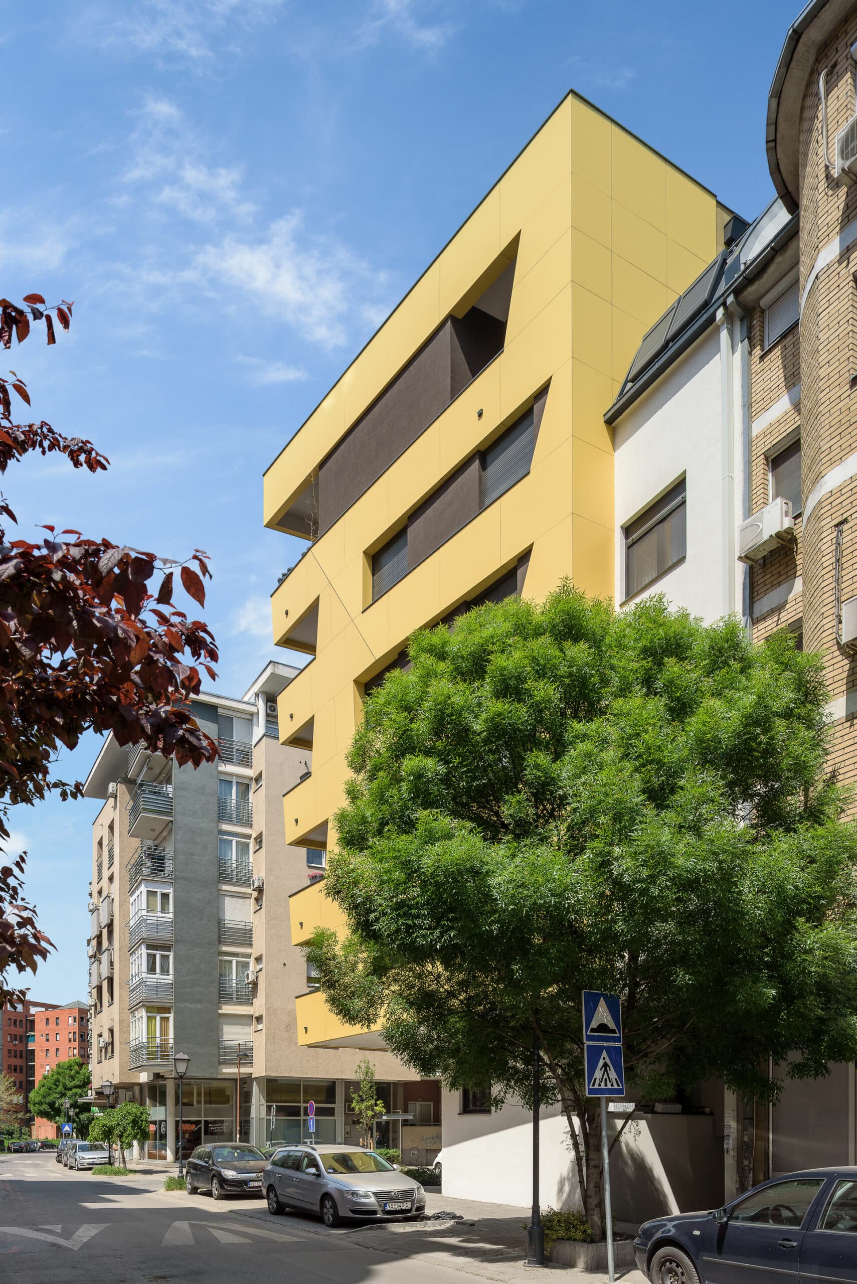
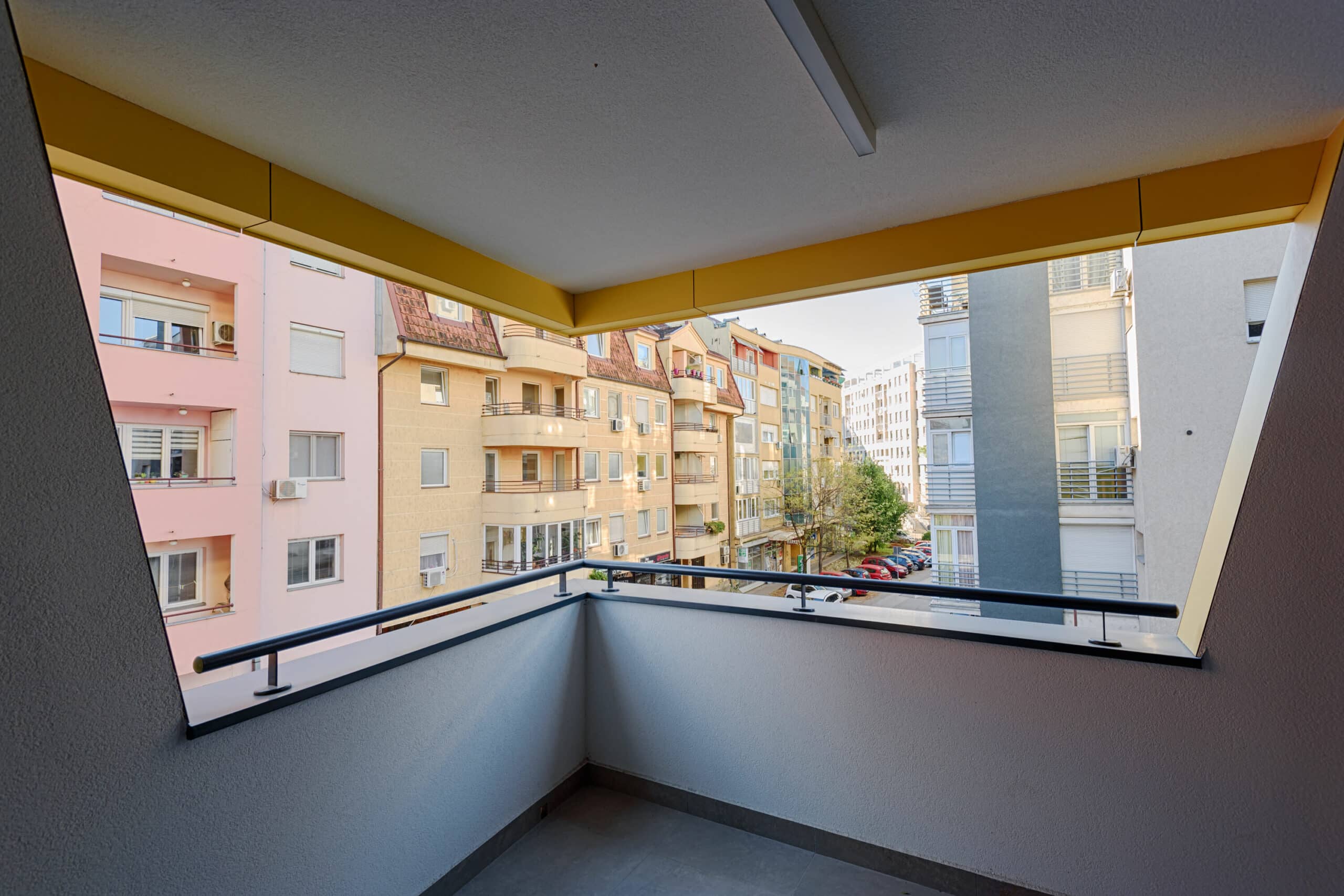
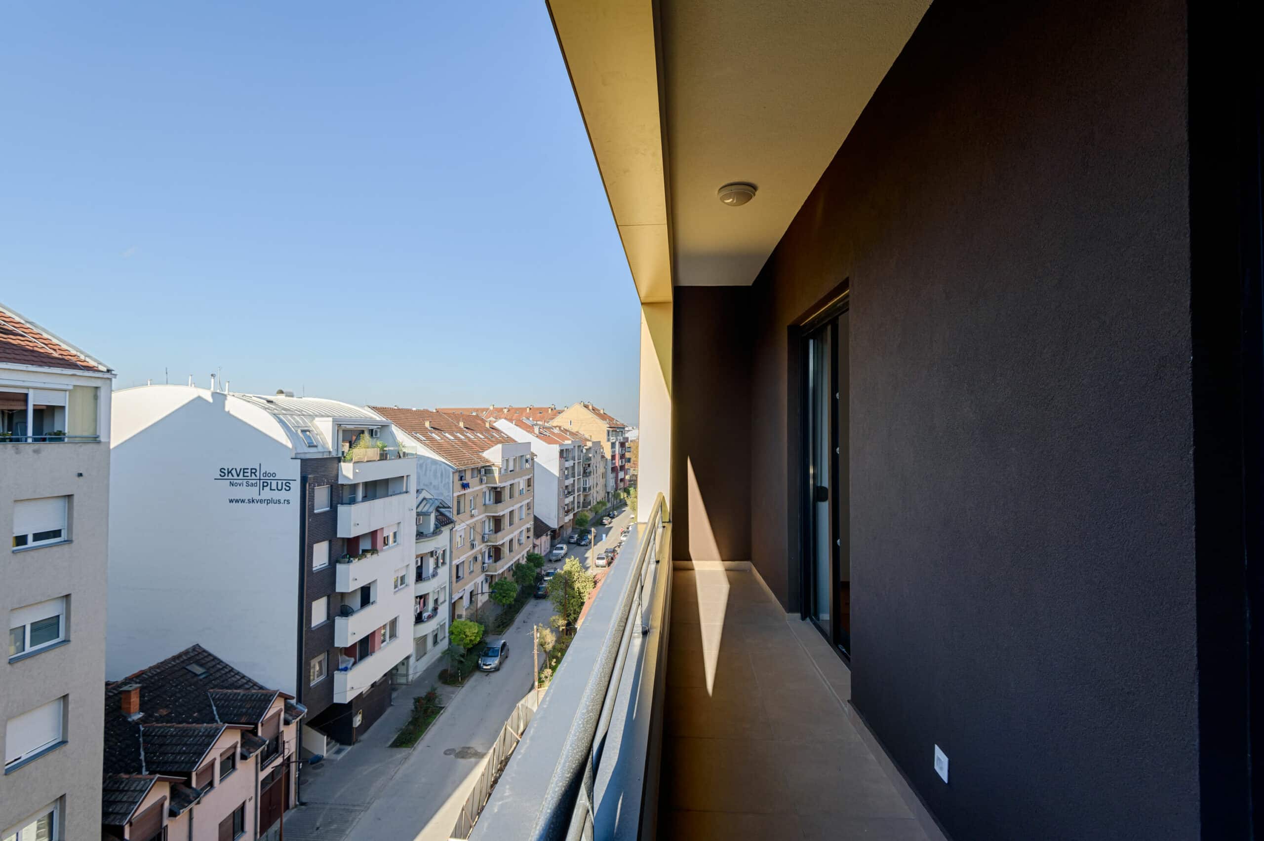
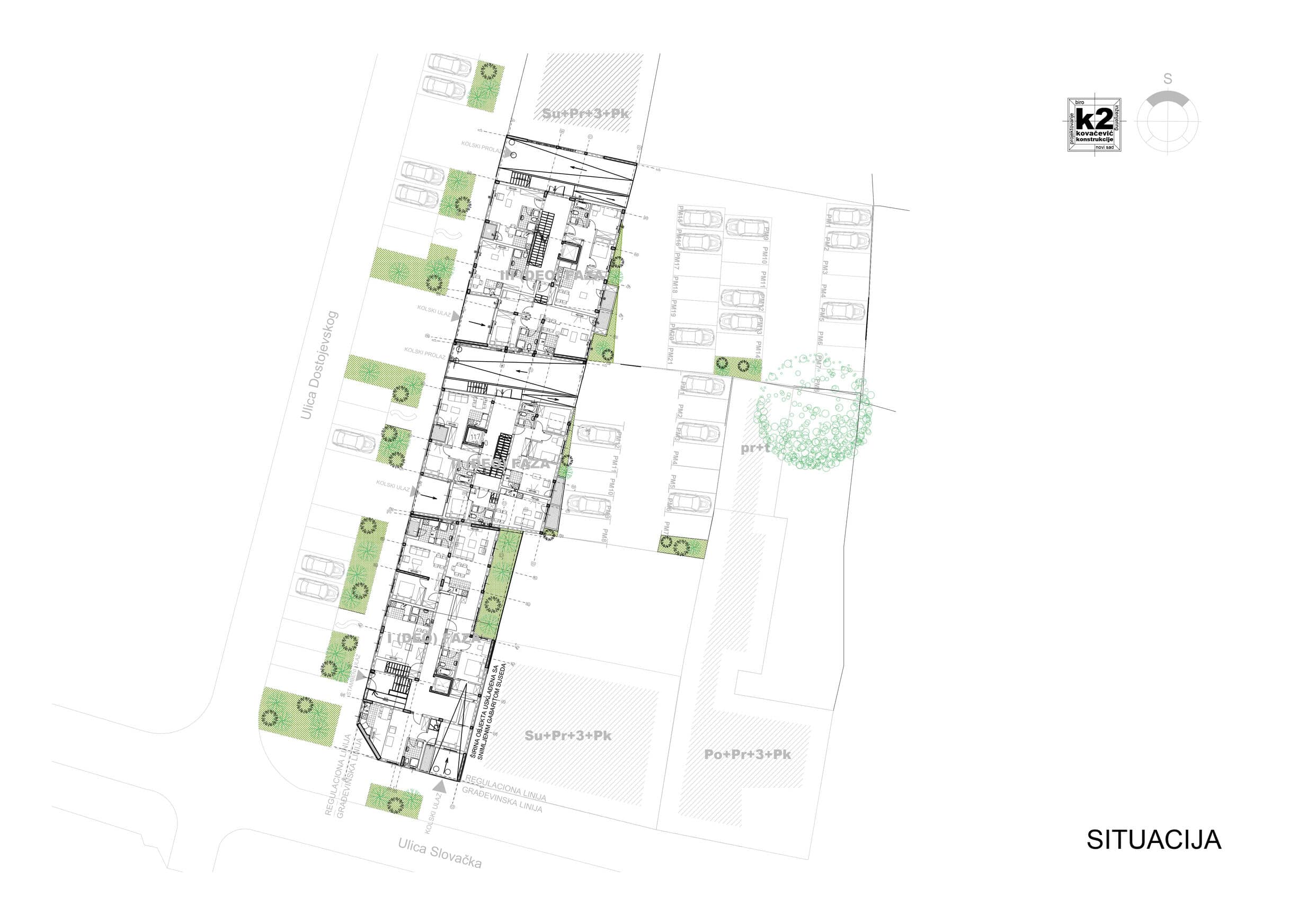
The corner always offers something more... As it often happens, some limitations luckily trace the path to follow. Due to the narrow streets, the view is only available from the actual corner of the building. And if we tilt the building a bit, there's a stroke of luck for the resident as their view down Slovačka Street meets with greenery and the famous residential building for military employees, of the architect couple Marušić. That's a good start.
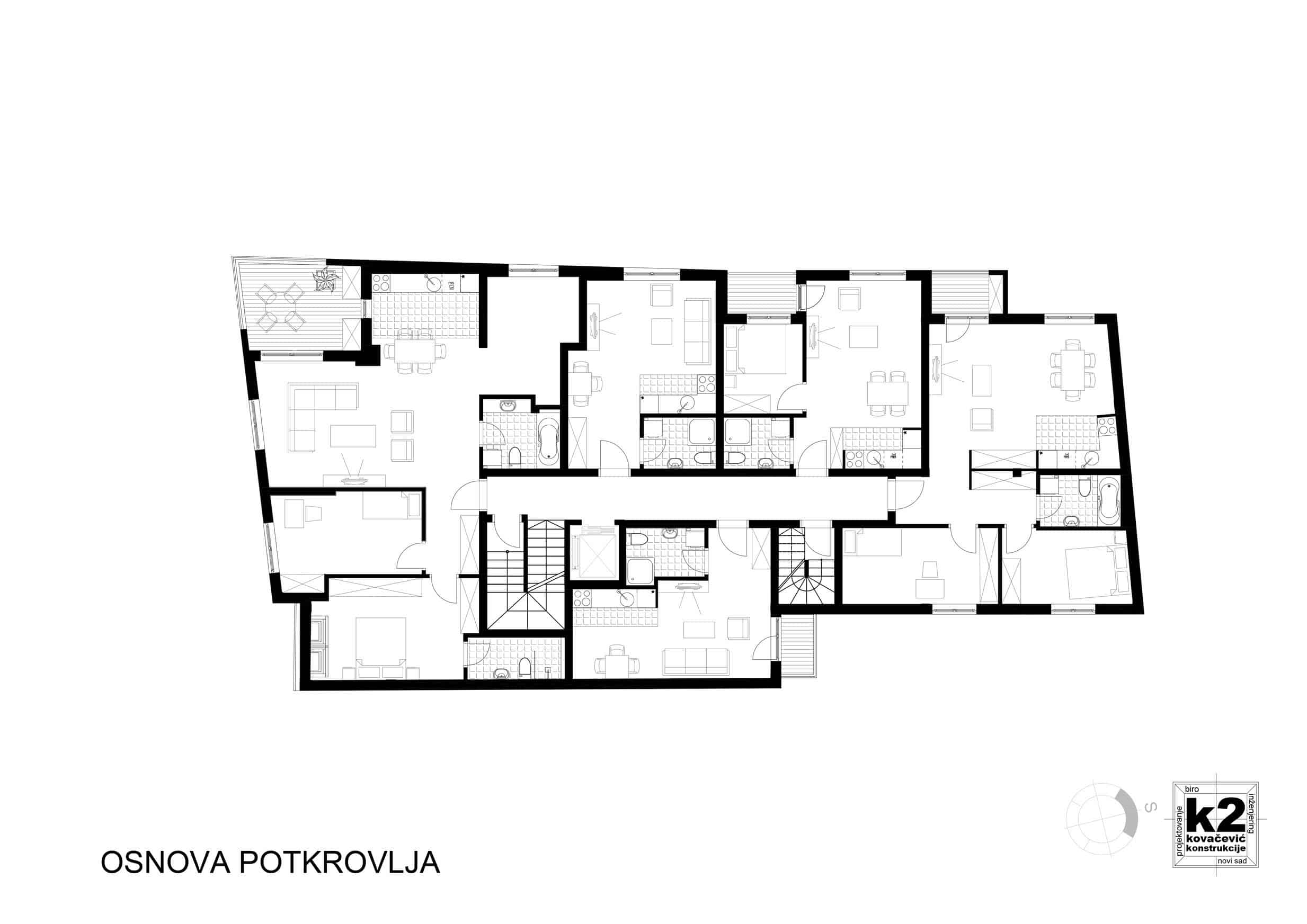
If we're already tilting to peek a bit, let's dedicate that view to someone who will hopefully have the opportunity to pause and enjoy it: the resident of the largest apartment and terrace on the floor.
The form naturally emerged from the function, as it usually does.
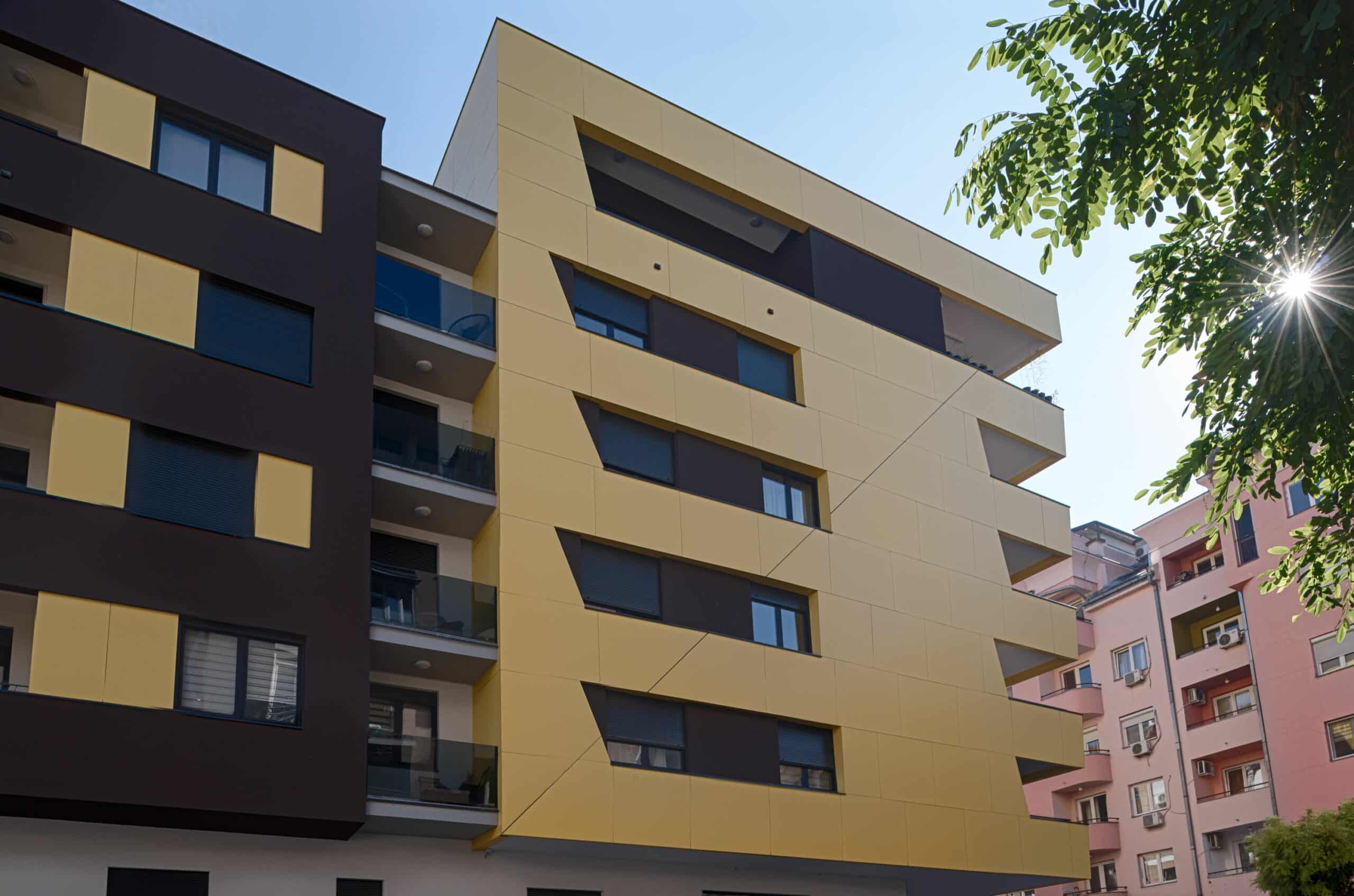
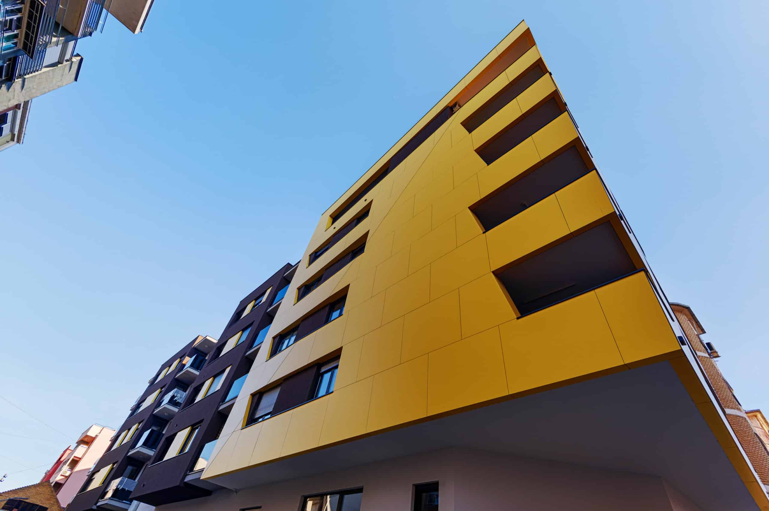
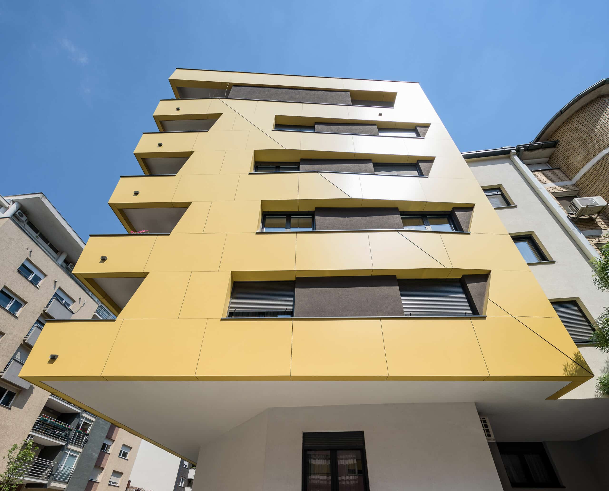
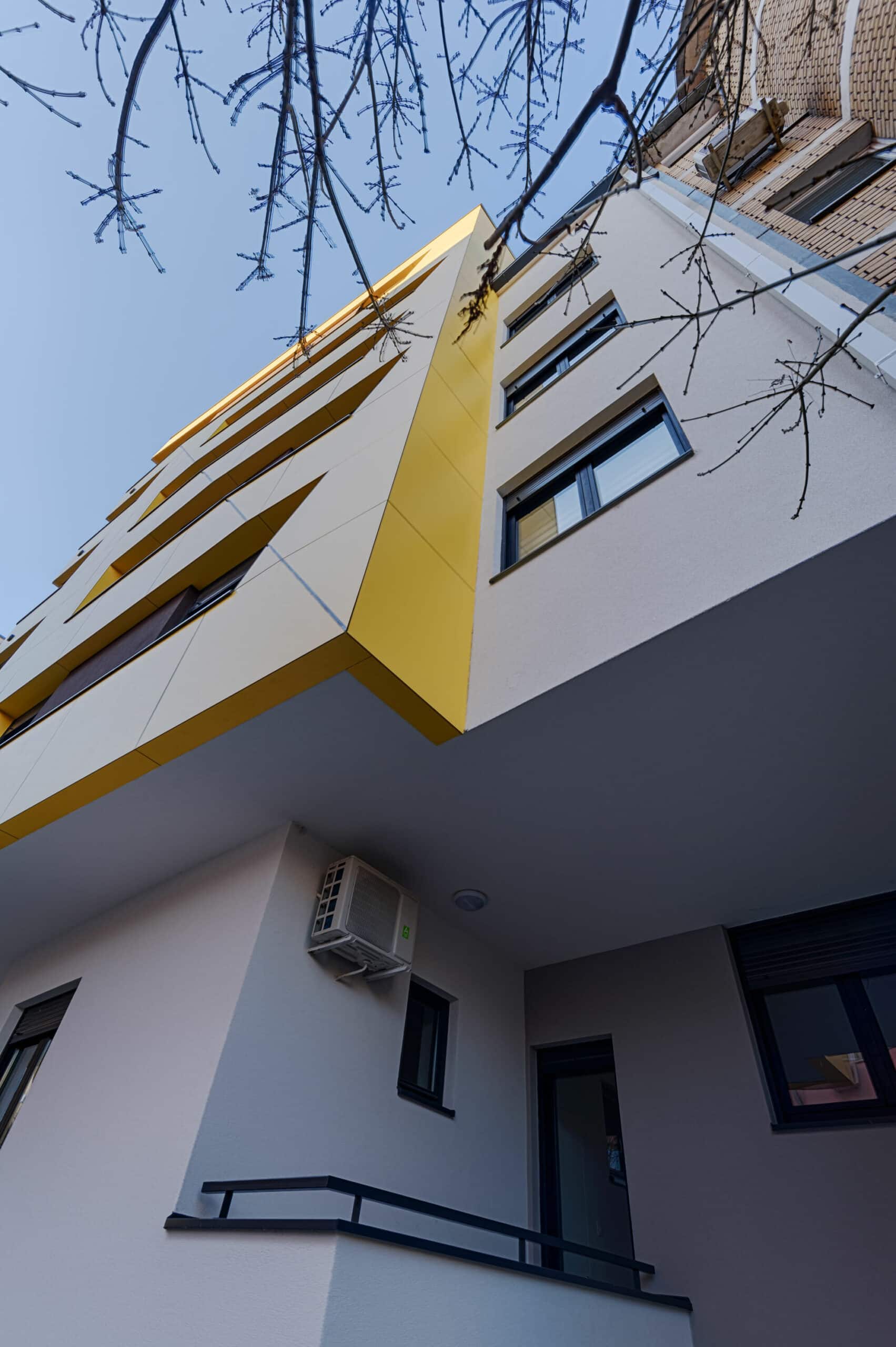
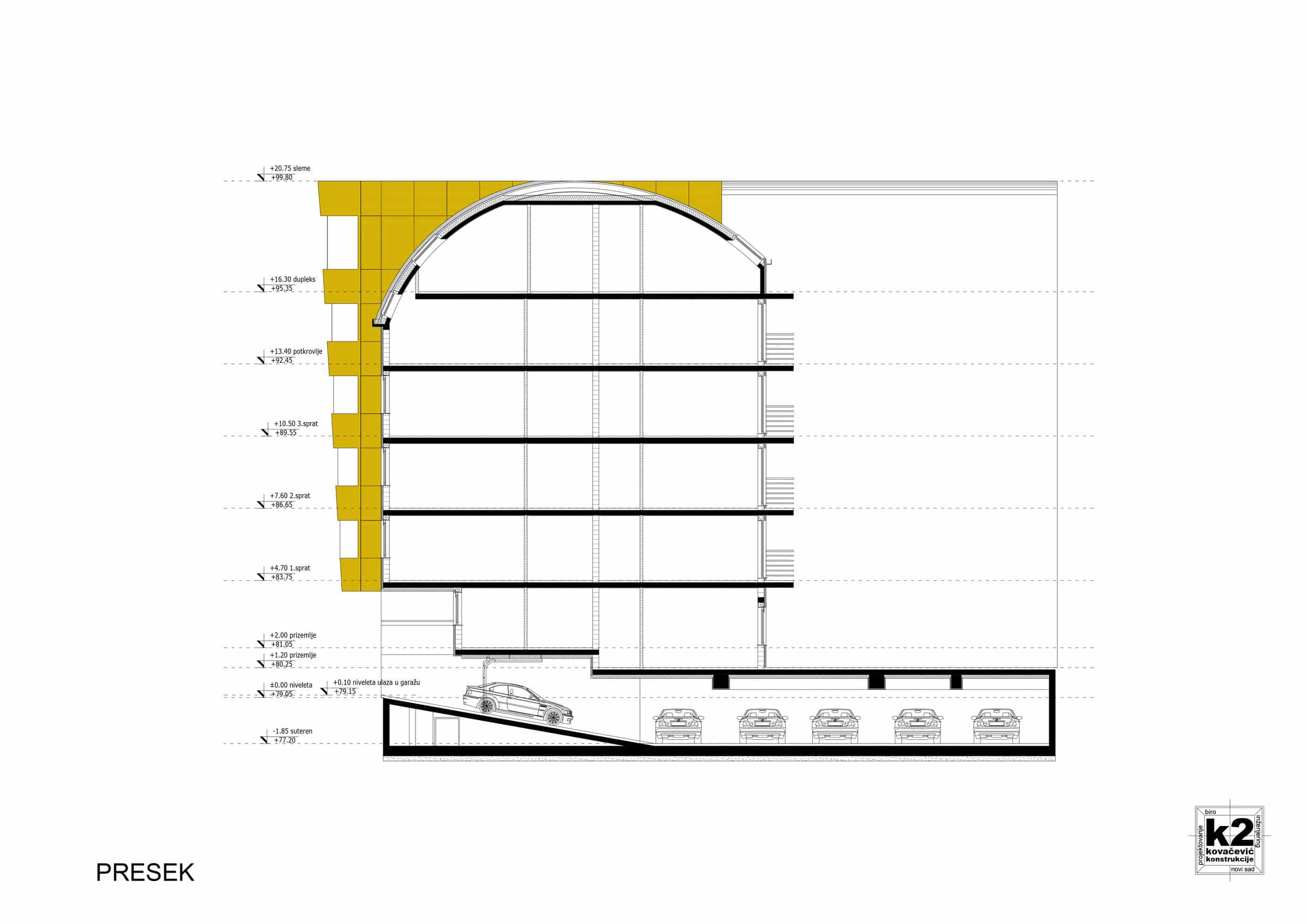
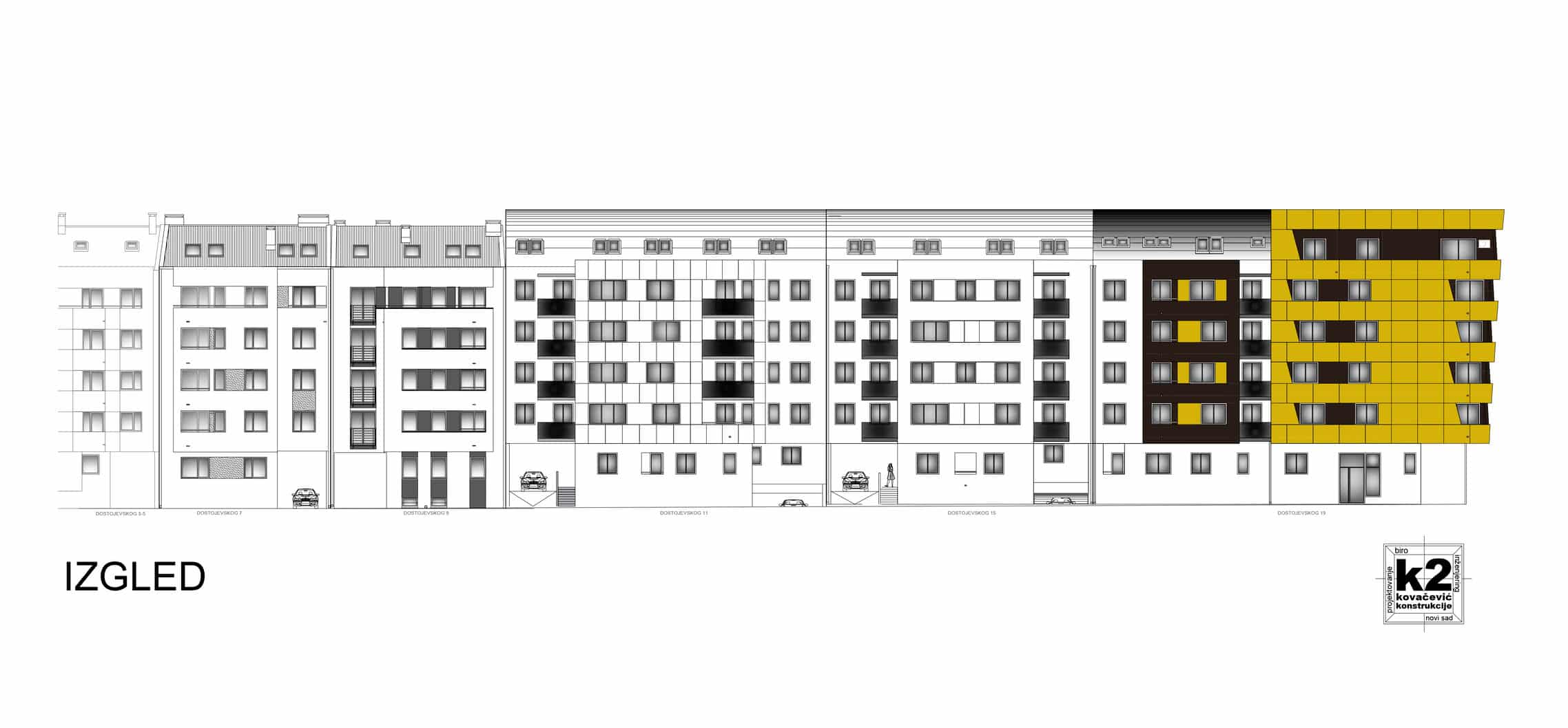
The symbolism and rhythm of the entire structure also originated from the inclined corner console that gradually protrudes like the bow of a ship on each subsequent floor.
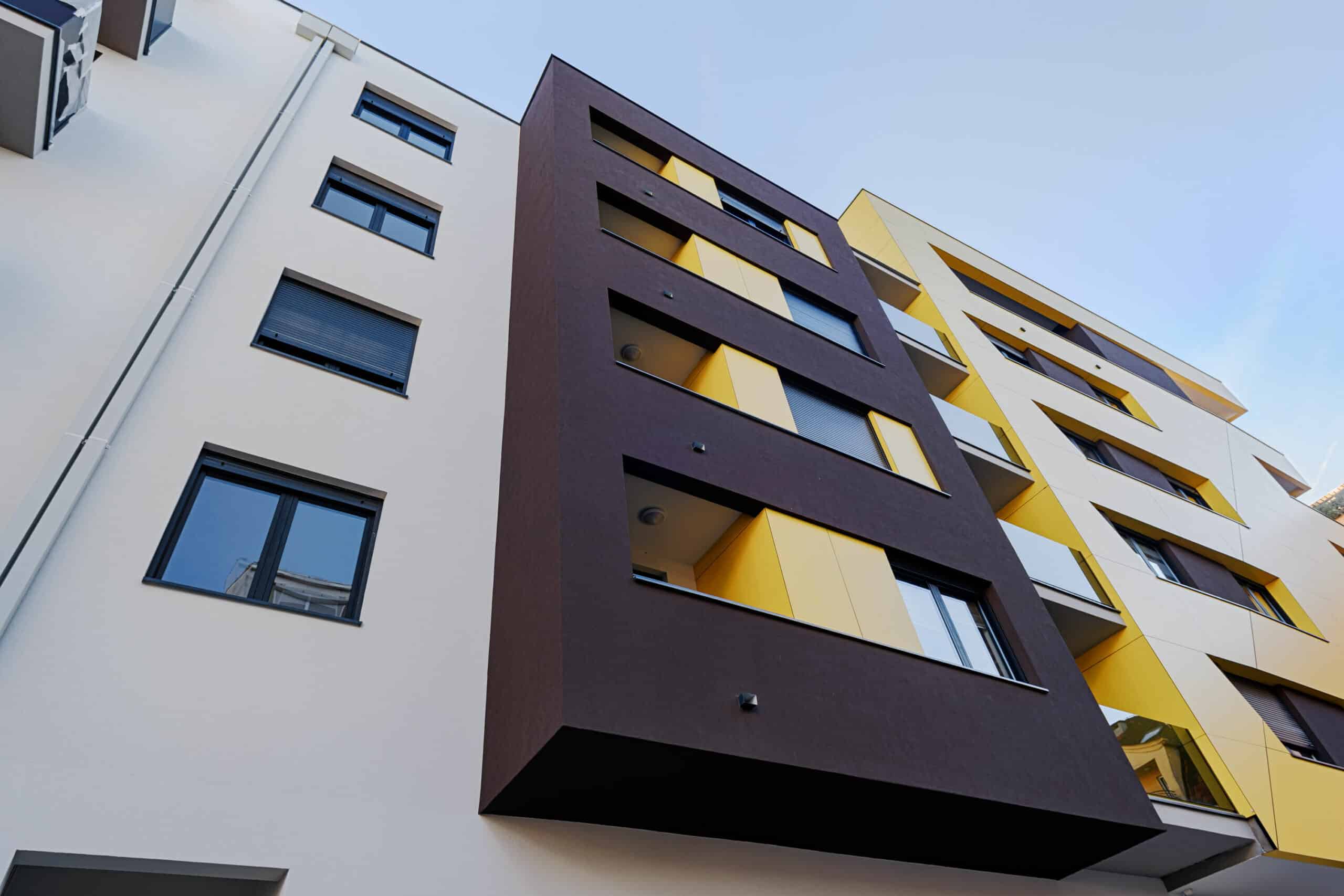
In this narrow space of the street, it's important to give the resident the chance to enjoy their privacy, so we concealed it a bit from the view with the sloping walls of the balcony, without disrupting their intended view.
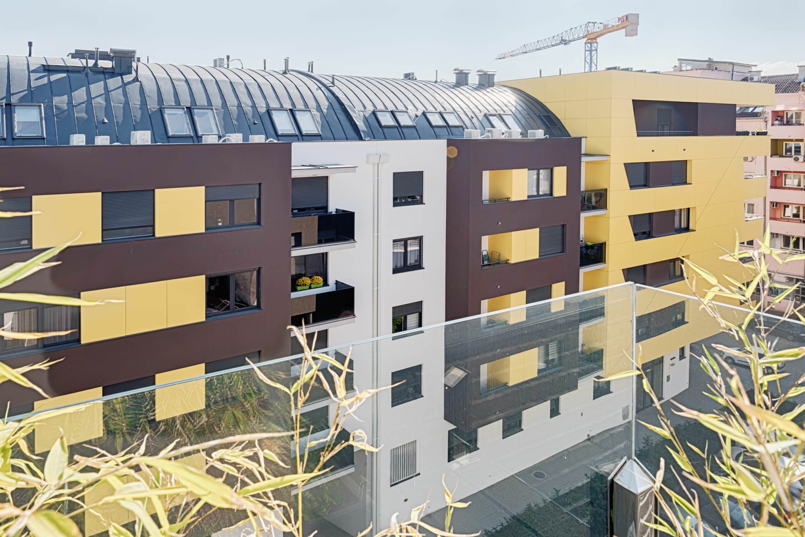
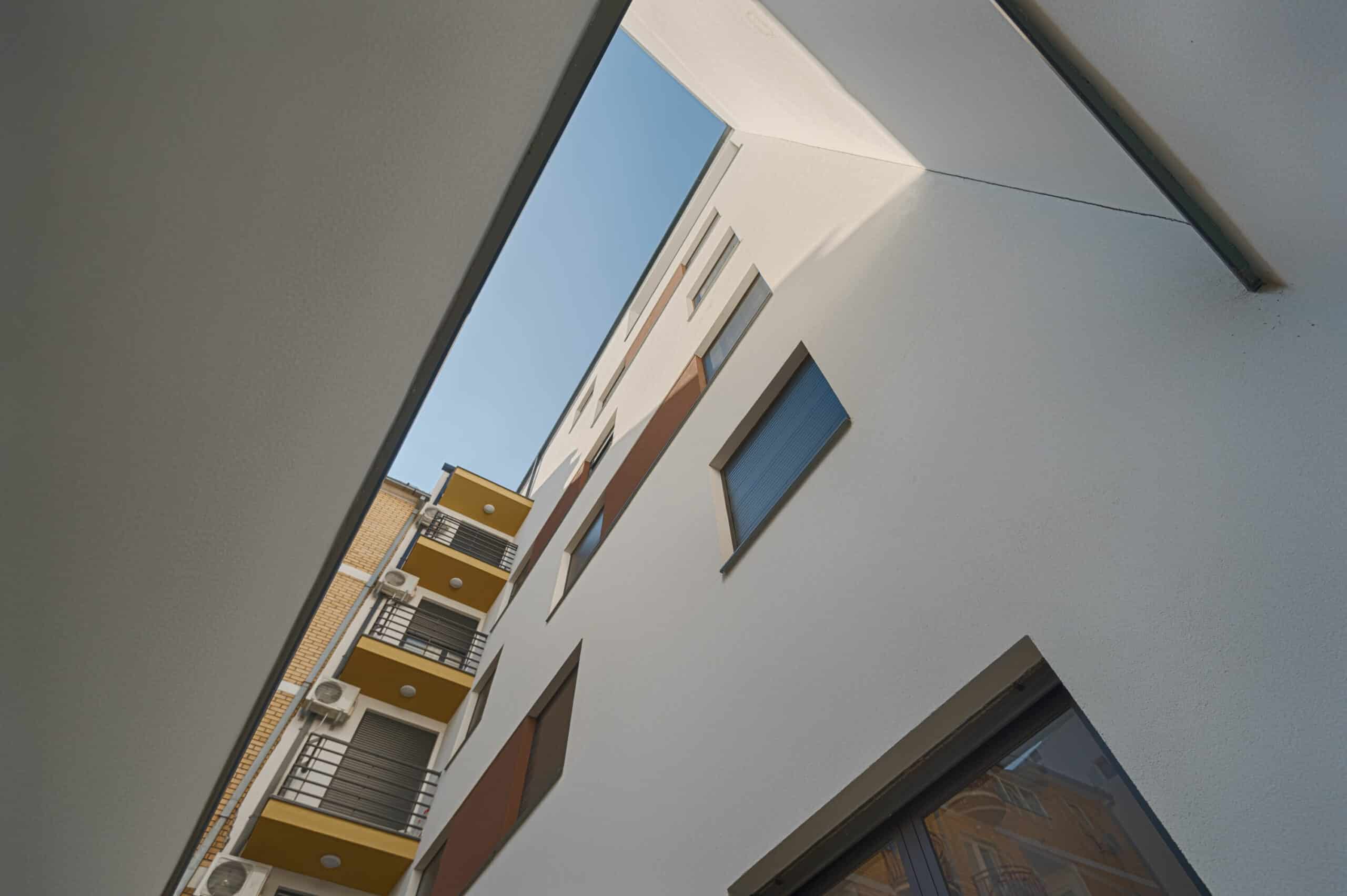
Openings and their slopes wander and follow the playfulness, achieving a crescendo with the diagonal breaking of the facade plane using compact panels. The facade doesn't tolerate distortion like a bow cast in a mold, so the two triangular planes with opposite slopes only enhance the playful nature in which balcony and window openings, their sills, and frames of different shapes and slopes willingly participate.
The colors on the facade attempt to harmonize with the vibrancy of surrounding buildings. Symbolism imposes itself with the neighboring structure made of yellow brick. By connecting the cornices, it's as if this neighboring building, constructed in the spirit of postmodernism, translates into a new era of architecture.
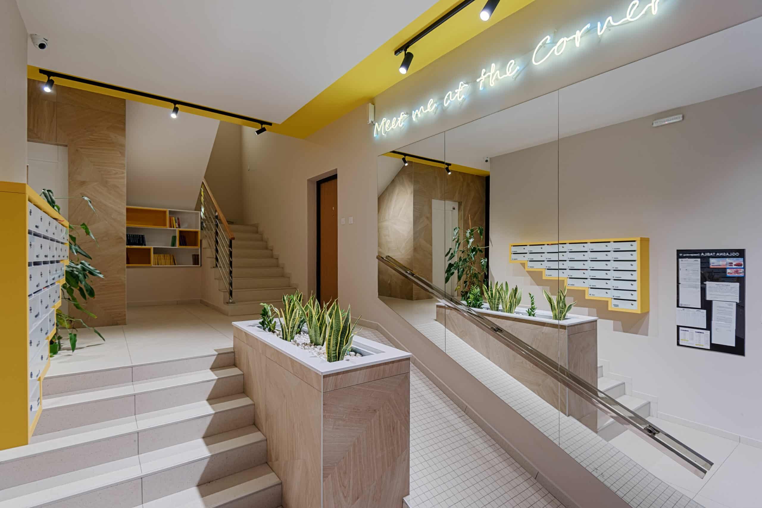
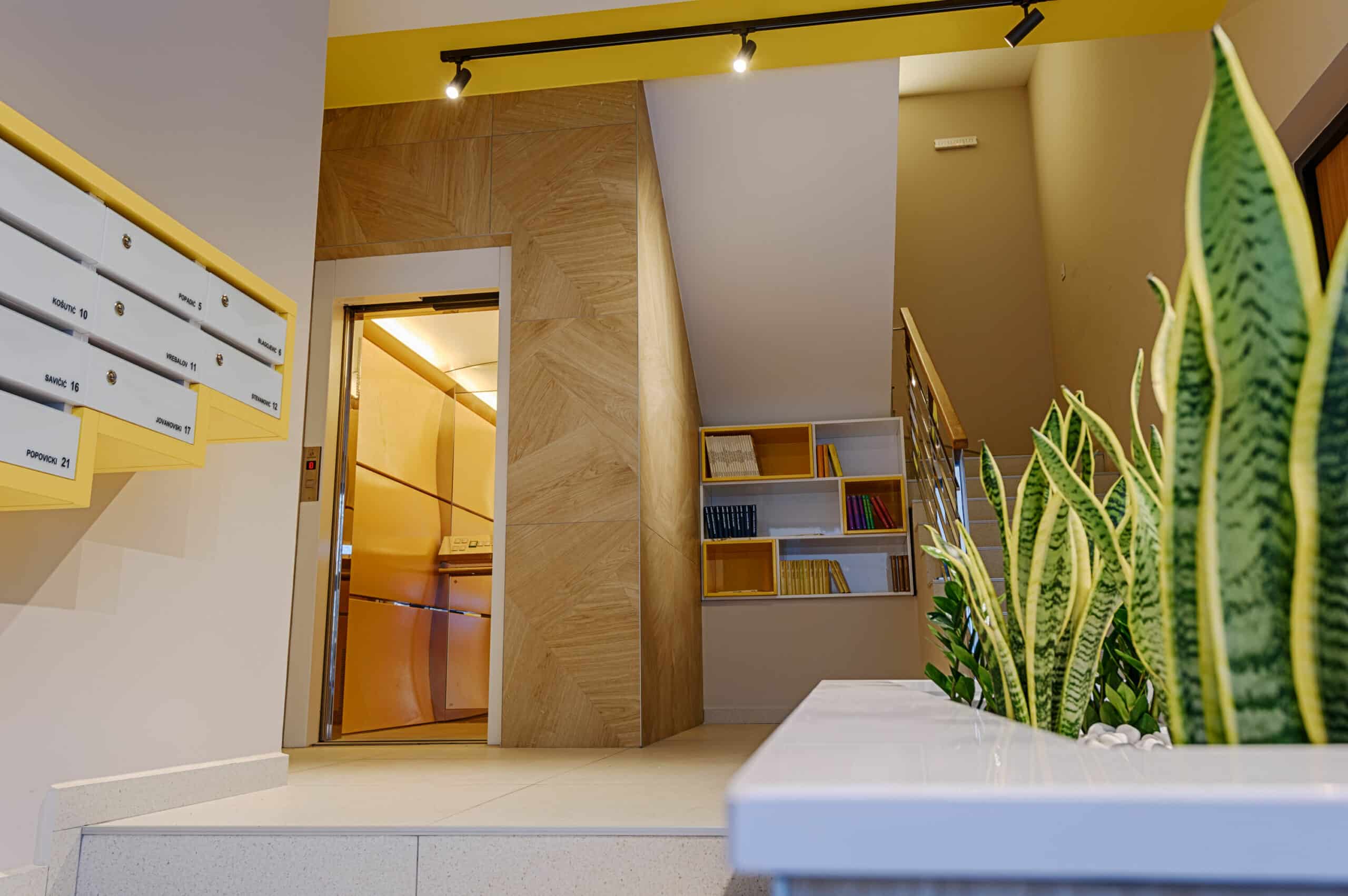
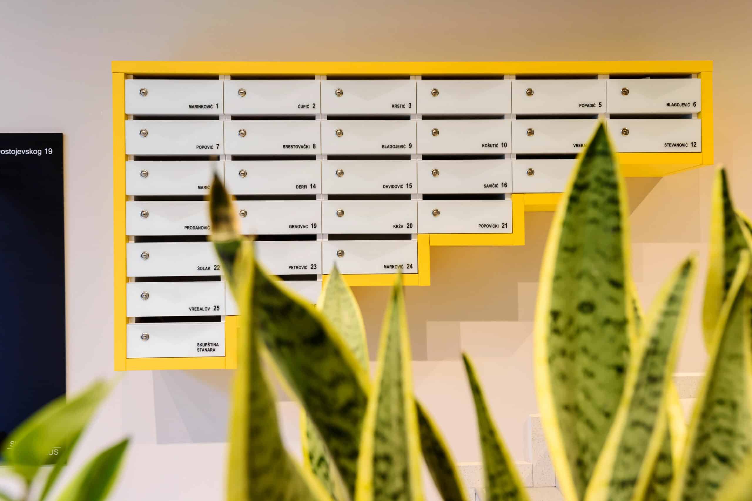
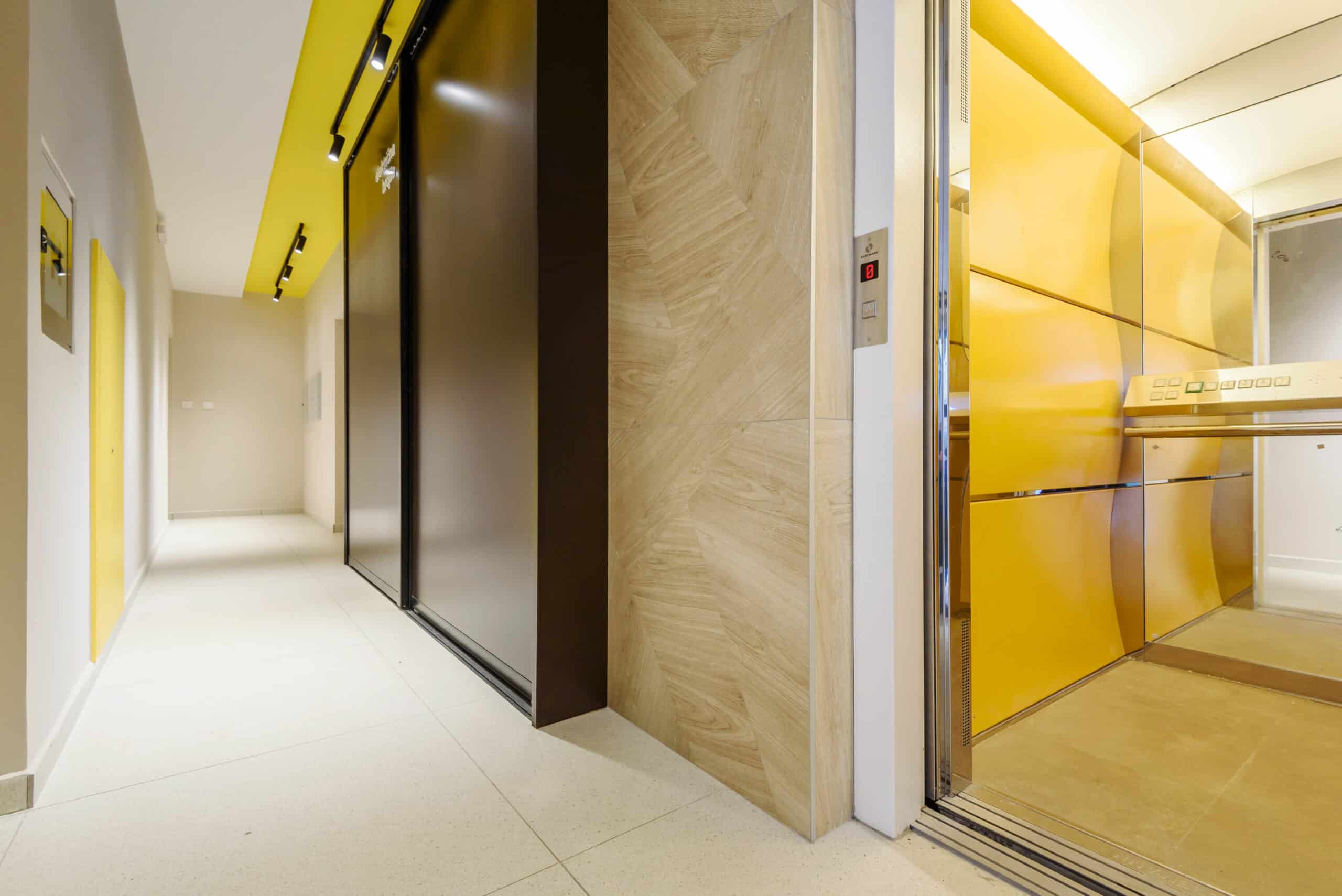
The interior follows the story, aiming to provide future residents with a sense of continuity of the experience from the moment they engage with the building. It may sound cliché when we say TOTAL DESIGN, but yes, the goal was to show that with a little effort, it's not necessarily a matter of a large budget in a residential building. This is reflected in practical elements such as a small library for book exchanges, mailboxes, evacuation plans, and other useful amenities.
MK 2.23.


